24.12.09

Life imitating thought

I’ve been chatting to my friends about a theory of ideas. The essence is that ideas shouldn’t be horded, but rather they should be set free so that more (and better) ideas fill the gaps that the others were taking up. For the last year or two I’ve been noting the ideas for projects/designs/other random thoughts in my iPod Touch, in the always handy Notes app. Handy until yesterday it crapped itself and deleted everything. So there we go, 50+ ideas that were waiting to be realised (on that infamous rainy day) vanished in a flash. I am pretty disappointed in myself for not acting sooner to
(a) back them up
(b) complete them
but excited to see if my idea is actually true and the ideas waiting in the wings come into fruition in the new year.

21.12.09

17.12.09

Come on in.


It’s always interesting doing some tiding up. Sometimes you’ll find a thing you had totally forgotten about. Like this drawing. Completely skipped my mind. Never finished, but now not forgotten.

5.12.09

The future of (interactive) magazines

Sports Illustrated has some very interesting ideas for the future of a magazine. I’ve been following/learning the development of interactivity of the pdf format (via inDesign and Acrobat) but this it something else. (watch at fullscreen for the real deal).


Via John Nack

3.12.09

Junos represents

Back in the motherland the whirlwind that was the 2009 B2B awards is settling down. It’s nice to see that Junos, a project that I branded last year while with Base One, has just won an award. Well done chaps.

2.12.09

Books come to life

Lovely work by ColensoBBDO, Auckland.

28.11.09

Help Portrait

Help Portrait is a movement of photographers who are using their time, equipment and expertise to give back to those who are less fortunate this holiday season. If you are interested in getting involved on Sunday 12 December just follow the links.
This is the poster I designed for their cause.

20.11.09

16.11.09

Think about the children

OK, it's pretty obvious really, but the people who prove things for a living have proved that “brands leave their mark on children’s brains”.
…participants were quicker to recognise brand names they had encountered from birth… participants aged between 50 and 83 years were quicker to recognise early brands over newer, current brands, even if the early brands were long since defunct… The evidence suggests that mere exposure to brands in childhood will make for more fluent recognition of those brand names in adulthood that will persist through to old age.

So what does this mean? Perhaps think about baby books, logos on bibs, and merchandise broadly if you want the little humans to feel an affinity with your brand later in life. But it is a fine line. They might just outlast you.
Via BPS.

15.11.09

More Munn

If you didn't see Jason Munn’s lecture last week, you should really visit his poster exhibition on Tory Street before 21 November.

10.11.09

Jason Munn tonight

If you aren’t going to see Jason Munn tonight in Wellington you’ve really got to ask yourself why. So, I’ll see you there.

9.11.09

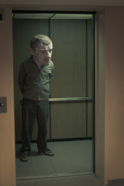
Eric's head

Eric Testroete wins the award for best Halloween costume ever. Brilliant. Quite brilliant. And disturbing.

5.11.09

Collective creativity of Minuit


For those of you who missed the hype, Minuit have released their new single Aotearoa. Word went out for folk to submit photos of them in NZ, and before you know it there it is, just in time for summer. See if you can spot friends and family because there are hundreds of folk in there. In this age of hyperrealityspecialeffectness it just goes to show that a good idea is a good idea, and a feelgood idea is even better.

30.10.09

Internetland is a wonderful place

Once upon a time, The Collective (a group of design friends in New Zealand) painted pictures and filmed the process, selling the timelapse film with the painting thereby letting the purchaser own the entire process, not just the final output. Somehow, someone in Internetland found the original video and showed it in Manchester as part of Oxfam’s Climate Change even (images above). Like they say: every bit helps. The Internetland is a wonderful place indeed.

27.10.09

Awesome illustration of not me

A totally random find here: the work of Austrian designer Paul Leichtfried. In particular this piece above. Ok, I’m biased, my name hardly ever appears in print, so forgive me if I get a bit excited, it it really is lovely. Check out the rest of his work, you won’t be disappointed.

17.10.09

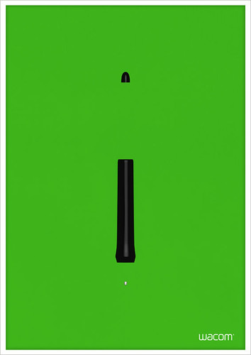
Wacom now in colour


Wacom green, originally uploaded by smoothfluid.

Following the trend of virtually every product out there, Wacom are moving away from one-colour-suits-all to something a bit more exciting. Here is some of the work we have carried out recently to promote the new range of coloured pens available this Christmas.

13.10.09

Trendwatching me

It comes as a huge surprise to see my work gracing the screen of the legendary Trendwatching October report. In particular because it is about NOWISM*, and the piece in question was created over 3 years ago. Perhaps I really am a futurist after all.

*“Consumers’ ingrained* lust for instant gratification is being satisfied by a host of novel, important (offline and online) real-time products, services and experiences. Consumers are also feverishly contributing to the real-time content avalanche that’s building as we speak. As a result, expect your brand and company to have no choice but to finally mirror and join the ‘now’, in all its splendid chaos, realness and excitement.”

About SEO

There’s an interesting article about SEO by Derek Powazek

“It’s not your job to create content for Google. it’s their job to find the best of the web for their results. Your audience is your readers, not Google’s algorithm.

Which brings us, finally, to the One True Way to get a lot of traffic on the web. It’s pretty simple, and I’m going to give it to you here, for free: Make something great. Tell people about it. Do it again.

That’s it. Make something you believe in. Make it beautiful, confident, and real. Sweat every detail. If it’s not getting traffic, maybe it wasn’t good enough. Try again.”

Undoubtedly his post will rank pretty highly. And quite rightly so.

6.10.09

PhotoSketch, or ComputerShop™

PhotoSketch: Internet Image Montage from tao chen on Vimeo.

Wow. This could do me out of a job. I have concerns about the legalities of the image selections but love the technology. Try it here. Via Creativebits.

2.10.09

In your Facebook

Something isn’t right here. I realise that Facebook has redefined what ‘friend’ can mean, but ‘like’? Get real. Get smarter. Do 4 people really ‘like’ this? I think not.

29.9.09

Google in an emergency

A handy use for Google Maps for planning an escape route to the impending Tsunami alert here in NZ.


View Tsunami Arrival Times in a larger map

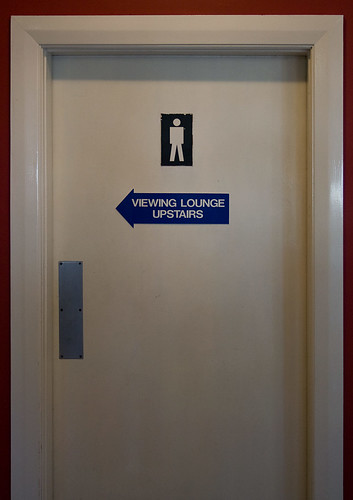
Viewing lounge


Viewing lounge, originally uploaded by smoothfluid.

I love seeing stuff like this. This is at the Wellington Aero Club.

15.9.09

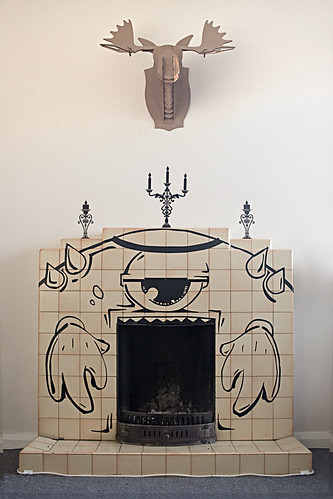
Fire Monster


Fire Monster, originally uploaded by smoothfluid.

The talented EYEQ gifted us a monster piece for our fireplace. Check out more of his stuff on his flickr.

12.9.09

Hevetiki

Just discovered the work of Matt Moriarty of Smlfort. How brilliant is this.

11.9.09

10.6 glitches and fixes

It is been a couple of weeks with 10.6 and at I feel that my initial apprehension of upgrading blindly was largely unfounded. That said I did clone my HD before (as I do weekly anyway) and ran TimeMachine (as I do regularly). Justin Case. and here’s what I found.
1/ Freehand MX bombed. Completely. Bounced on the dock a couple of times then nothing. Nada. Zip. Now don’t get me wrong, I love my Adobe stuff, but sometimes FH is better. Much better. It is like my sketch pad before Illustrator, and a future without it was looking pretty bleak. Luckily after an hour or two hunting I found that the problem was because I only has a single user license and as we speak this is a big problem. The solution:
You reboot from a version of 10.5 you have as a backup. (I love you SuperDuper!) (System Preferences>Startup Disc) then open FH. Open FHMX, Help>Transfer Licence>Quit. Open FHMX again and enter a volume license. Let’s be clear; I paid good money for my software and expect it to work when I am. It’s just that the single user license isn’t supported and I have bills to pay and brief to meet. I am not supporting cracked apps at all but if you are in the same situation as me you will need a volume license like this WPD700-59309-14394-64786 to get back on your feet while Adobe sorts things out. Quit FH again and Reboot with your 10.6 Startup Disc. FH is back.
2/ Bold fonts in Firefox having upgraded to 10.6. While not a big problem it was annoying. And the fix for me was quite simple. I figured it was a Firefox issue, but as it happens all I needed to do was purge my font caches. I run Suitcase Fusion 2, so I quit the Core (System Preferences>Fusion Core>Stop). Opened Font Doctor X>Tools>Clear font Caches and restart.
Business as usual.

20.8.09

To pubish or not to publish

Looking over my webstats I find myself listed as a contributor in an upcoming Logo2 book by Zexis. Which is nice, although I have some reservations as I submitted work over 2 years ago, possible 3, so I am not sure how indicative of current design trends it can be.
In other news, the talented designer and friend Monique Kneepkens is featured in the soon to be published Form book. More details to follow.

4.8.09

Type on the Moon

There’s been a bunch of chatter about the ‘other’ poster for the brilliant film Moon. Which, if I am being honest is the main reason I went to see the film, and boy is a visual feast, specifically the typography and the interfaces. I hunted about and found that FontFeed has beaten me to it pointing out that it is Micro­gramma/Eurostile Extended that make the experience so original and, well, just right. Go see the film. seriously.

31.7.09

Font table

Fontplore Showreel from Mphasize on Vimeo.
Not exactly an essential piece of office equipment but would be more useful that the stereotypical table-football/tabletennis table that sits in the corner gathering dust in many agencies. That said I did work in an agency with a Scalextric track which was cool…

28.7.09

Mercenary space marines need logos too

Logo concept for upcoming science fiction movie.

20.7.09

A year in the making


It's nice to see (at long last, in fact well over a year) my latest banners fluttering in the breeze all over Christchurch city. Photos of some of them below, I'll try and get the whole set soon (you can see the illustrations here in the meantime).

17.6.09

The world through Kids’ eyes

Without a doubt this was the song of 2008 for me, so it is great to see a music video with a difference to go with it.


Via Creative Review

11.6.09

Speed of word processing: Size matters.


“A new study shows that we're faster at processing words that refer to big things than we are at processing words that denote small things.
It is suggested that a reason why bigger items might generate faster responses is related to imageability. While both bigger and smaller items can be equally highly imageable, it may be that the relative speed of accessing a stored visual representation is faster when the object is bigger.”
Via BPS / Quarterly Journal of Experimental Psychology.

Where is the internet?

Some nice info graphics hidden in here too.

21.5.09

A beautiful 42 second film

Buying a big Mac [updated]

22 May 2009 13:14:00 Wellington Shipment Delivered In Good Condition.
22 May 2009 13:13:24 Wellington Out For Delivery.
22 May 2009 11:07:53 Wellington Shipment Received At Destination Depot.
22 May 2009 04:58:01 Auckland Shipment In Transit.
21 May 2009 16:12:24 Auckland Shipment Received At Origin Depot.
21 May 2009 13:50:22 Auckland Shipment Received At Destination Depot.
20 May 2009 08:36:49 Hong Kong Shipment In Transit.
19 May 2009 22:57:00 Hong Kong Shipment Held In Warehouse. Follow Up Actions Underway.
19 May 2009 21:30:00 Shenzhen Held Awaiting Correct Address. Follow Up Actions Underway.
19 May 2009 21:14:00 Shenzhen Shipment In Transit.
19 May 2009 20:41:06 Shenzhen Shipment In Transit.
19 May 2009 19:16:26 Shenzhen Shipment Collected From Sender.

12.5.09

2 Degrees


At last some solid news about the long awaited third mobile carrier in NZ. NZ Communications or whatever they were have emerged as 2 Degrees. Hang onto your hats chaps. I think things are going to get interesting, and hopefully we can actually TALK about it, not just flamin’ text to one another. Here’s hoping.

7.5.09

Signs


Watch it first, purely for the sake of distracting yourself on a Friday and then read the comments below…

3.5.09

Naming your url

Smashing Magazine posted a decent little article on strategies for naming your url – especially useful for times when you are convinced that the best names have all been taken. And, while your could take their advice you could also try this (sticker on a wall somewhere in London, made me look, and 3 months later check it out. Don’t fret it is safe for work and can be quite interesting).

30.4.09

Typealyzer tells it like it is

If you haven’t heard of Typealyzer I’ll fill you in: It’s an app that processes the content of a blog and spits out the personality of the author; thus:
The independent and problem-solving type. They are especially attuned to the demands of the moment and are highly skilled at seeing and fixing what needs to be fixed. They generally prefer to think things out for themselves and often avoid inter-personal conflicts. The Mechanics enjoy working together with other independent and highly skilled people and often like seek fun and action both in their work and personal life. They enjoy adventure and risk such as in driving race cars or working as policemen and firefighters.

Sounds a lot like me. Hours of fun on a Friday (and a useful too to understand potential audiences).

27.4.09

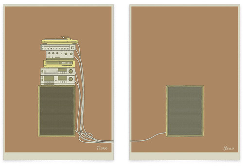
Mono-Stereo


Diptych poster set. One of those “rainy day projects” that has eventually come into fruition.

20.4.09

Ignore awards and have fun


Saying that I was at the opening of the BeST Awards exhibition last night and I had fun.

Salzburg Travel Guide


One of the best things about the world we now live in is how one seemingly irrelevant piece can become something much bigger. Like this photo on Flickr that I took last year while I was in Salzburg which is now part of mobile travel guide. A beautiful example of WebNext where we all help each other make the best of each experience.

18.4.09

Art imitates life imitates art


As designers I believe we have a certain responsibility, or at least we ought to. More a best practice than a code of conduct, self regulating rather than a book of rules. Like not misleading the audiences, or promoting behaviours that one might find morally objectionable. Or this, seen on the back of a truck about 1ookm south of Dubai. Try as hard as I can the only message I can see here is “to hell with the red light, let’s rip!” And if you ever decide to investigate the number of pedestrian casualties on the roads in the UAE you’ll see that this message is getting through.

13.4.09

Do brands matter in a recession?

Ije Nwokorie, Senior Strategist, Wolff Olins.

19.3.09

Award wining work


The BBT advertising pieces I created while at Base One have won the Best Use of Advertising, at the Construction Marketing Awards late last year. Excuse the lateness of the news but I only just heard about it.
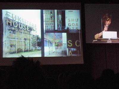
The Winning Campaign - “All Consuming Ambition”
(Technical & Professional)

Using a humourous hook and eye catching imagery to stand out from our competitors in industry publications, the winning concept uses visuals of structures relevant to sector(s) created out of everyday meals or snacks to demonstrate all consuming ambition.

We have adapted and worked with the designs, not just for publications but E-shots, flyers and posters, as well as banners and exhibition stands. These adverts have proved immensely popular with clients and candidates alike, prompting positive feedback and praise, even from our competitors.

We are extremely proud of the success this advertising campaign has had, and thank you all for the support and feedback you have given over the past year.
More here

Funny how there is no mention of the Base One creative team there… So to rectify that, props to Dave Thomas (CD)and Dan Cummings (production whizz) at Base One and Chris at Storm for his legendary skills with the Hasselblad.

16.3.09

Paul Elliman at TypeSHED11


Paul Elliman is an artist and a writer, who uses letters and words in their most abstract forms to create pieces of art. I’ll be honest and admit that I didn’t know of him before he presented his work and ideas but having seen him talk I feel I have missed out a bit. Years ago I got my masters in perceptual psychology, and my dissertation was on object perception. The work I did then on lanellas and typical contours was pretty much forgotten until Paul’s presentation. Typical of his work is the distillation of an object representing a letterform to a single cross-section, its silhouette it you will, and then creating a message/idea from a collection of these forms (he never uses the same form twice). Much like Build’s Objectified piece.
He further abstrated the idea of messaging in a piece where the male and female voice artists commonly heard on the metro in Barcelona gave instructions from Spain to his house in London. Very interesting stuff and a name I will not forget.

11.3.09

Donald Beekman at TypeSHED11


Donald is pretty much single-handily responsible for all the drug (legal) and alt-drug branding and packaging to come out of Holland, through his company DBXL. And a fine man for the job really. Being in a variety of bands since his youth led him to combine his influences of music/psychedelic/acid house/punk etc into packaging that makes your eyeballs throb. But don’t just take my word for it, check out his website for a trip back in time or on my flickr for some eye-candy.

Experimenta at TypeSHED11


I have a soft spot for the guys at Experimenta (you won't see much in their site, it seems to be a blank one for now, so see our flickr). I have seen Duncan show his wares on more than one occasion and appreciate the craftsman approach, the constant struggle of setting up and maintaining design integrity. Their work is top notch too, although I sometimes feel it is a little cold. Not in the piece shown above though: they managed to get the symbol from the U.N.C.L.E into the branding for the Global Leaders Consortium. Nice.
There are obvious comparisons to the legends Experimental Jetset (and not just in name) but it is early days – they are not even 2 yet) and they have got a bright future ahead of them in my opinion.
More on Flickr.

Sydney Shep at TypeSHED11


I'll be honest and admit that the idea of sitting though a 45 minutes history lesson of what I tend to regard as a naff bit of laziness didn’t interest me much, however I was to be proved very wrong. Sydney presented a very interesting piece indeed and if you were to take home anything let it be this:
“The smiley was born on 16 February 1882”
At least that is what her research in the much loved St Brides Library tells her.
More on flickr.

10.3.09

Mother of All Funk Chords

A wee musical interlude from the TypeShed11.
Let the people do your work.
More here. Via UrlGreyHot.

26.2.09

Masayoshi Kodaira at TypeSHED11


Hold crap this guy is the biz. Without a doubt Masayoshi has the BEST way of presenting his work I have ever witnessed. Not that he needed it. His work is outstanding. His understanding of print processes and finishing is phenomenal. My account won't do it justice. My cheap, blury snaps are hardly worth showing. Hunt out all the work you can find and study it. And try to be half as good. I wish.

Bruno Maag at TypeSHED11


I have always respect what Bruno has had to say (I even have a set in my Suitcase of ‘fonts that Bruno recommends’ that I gleaned from an old issue of Baseline) so was keen to see him in person and witness his passion, and man, is that guy passionate about what he does.
He spoke primarily about the global village and how one shouldn't neglect the cultural aspect of an area by forcing Latin alphabets on them, nor by just dropping in whatever alternative tanslation you can find. An example: Dalton Maag is working on Dubai's metro system where the signs need latin and arabic information. If one is going to do it properly the arabic needs to match the latin (or vice versa) in which case one will have to create it from scratch. And to do it properly one needs to know about the language, the letterforms, how it is written (the angle of the pen is differnent by 15 degrees for a start). So Bruno's team are all off to learn Arabic.
He also had some strong words to say about the 2012 logo and the typeface, but that is old news.
Oh, and he is more passioanle about food. Seriously, if you see him ask him about food. He knows one or two things.
Photos on Flickr.

Indra Kupferschmid at TypeSHED11


Picking a typeface, the right one, not just anyone can be a mare, but like the Lone Ranger on Silver Indra Kupferschmid came the the rescue with some thoughts on how to think outside the box. She is also responsible for the new font classifications, like the one the FontShuffle iPhone app I think. If there was one idea to take away it was “don't worry, people generally will read it anyway,” a thought that helps me sleep at night.
Photos on Flickr.

Kris Sowersby at TypeSHED11


Always the entertainer, Kris has trouble zooming out and was keen to share this with the audience. His job as the kingpin at Klim is to lock himself away and massage a typeface into something new. It is the minute details that turn him on. So he is always surprised when this creations are set free and become more than he foresaw. Like the new typeface for Methven.
Methven was rebranding and wanted a bespoke typeface, something that had loops/drops (hey it is all about water). Taking National, a face he designed (so he knew he wouldn't get sued!)he worked it into a new direction then left it in the hands of Tana Mitchell to work her magic.
More on Flickr.

22.2.09

Experimental Jetset at TypeSHED11


I have been lucky enough to see this Dutch trio on a couple of occasions and they never fail to amuse and inspire. They focused on their influences this time; the things that they saw that got them where they are. Like how an anarchic backwards 'a' inspired them to turn their text upside down, or how the jewelry in an exhibition was only viewable from outside the gallery, leaving the inside virtually empty, and how the language of two-tone, and Prince inspired their punk minimalism. And how this led to other things.

Bat Macumba & Experimental Jetset from Caspian Ievers on Vimeo.

See them on Flickr.

Kelvin Soh at TypeSHED11


One half or Auckland outfit The Wilderness, Kelvin leans heavily on the side of design as art. This talk, entitled design in the space of friction, focused on the idea that something is only useful if it is used, but not necessarily for what it was designed for.
The designer might make suggestions but at the end of the day the control is in the hands of the audience. An obvious example is that of skaters in urban environments using the architecture to their own advantage, but Kelvin showed a great piece that filled the gap between exhibitions at an Auckland gallery. In essence a non-poster, empty with a different frame or border each time. Tween posters. In his own words they celebrate uselessness. But after few have been put up the viewer then adds meaning to them, i.e. there is no exhibition at the moment but there will be soon. Ironically, having completes a series of them they were all exhibited in the gallery.
More at Flickr

Christian Schwartz at TypeSHED11


Type designer extrordinaire Christian spoke about how the Font Menu gave us choice. Type is clothing for words, but like clothing we all have different tastes. Some of these tastes are regional; like Franklin Gothic in USA, Gill Sans for UK, Vendrome in France.
See more at Flickr.

Sarah Maxey at TypeSHED11

Sarah collects everyday words and phrases and draws then, exaggerating their importance and often imparting a different meaning to them in the process. And she is very good at it too.
See more at Flickr.

17.2.09

Stephen Banham at TypeSHED11

Stephen is a storyteller, and self-proclaimed type evangelist, which is pretty handy as he’s the guy behind the type foundry Letterbox. Funny dude too. He opened my eyes to the worlds biggest logo, a whopping 2 miles across. each letter is 180m x 140m, with a stroke width of 12m. That’s like a motorway. And if you don’t believe me look at this (I love GoogleMaps). Apparently is isn’t a logo (say Reaymix) as that wold be illegal, rather it is a 4 way landing strip for the flying doctors or somesuch. Yup.
Apparently there is also some dude who has trained birds to fly in logo-formation. As long as you are called ‘V’. Actually VOLVO, NIKE and ANZ hav all been done (but I don’t have photos to prove it). He also recounted a slightly disturbing story about the recall of brands by school children and how accuratly many could draw the logo from memory. While the Nike swoosh is not surprising the ligatured db of Cadbury was accuratly reproduced by one, which is just nuts.
Type is an expression of our language, and our language is our culture.

More photos on Flickr.

Leonardo Sonnoli at TypeSHED11


February 11–15 2009 saw the birth of TypeSHED11, a “clued-up concoction of [typographic] commentary” with international speakers talking frankly about their work/inspiration/knowledge.
Leonardo Sonnoli’s An egg is not a potato presentation was an insightful talk about the books that he loves (one of which is a book of sounds: it has no words but is made of different paper so the pages make different sounds as you turn the pages) and the typographic/design work that was influenced by them.
More photos and comments can be found on Flickr.

15.2.09

TypeShed11

Wellington has been playing host to some of the biggest names in type and typography on this planet at TypeSHED11. And what a privilege to hear them speak over the last three days.
Experimental Jetset, Bruno Maag, Paul Elliman,Leonardo Sonnoli, Stephen Banham, Christian Schwartz, Kris Sowersby to name just a few…
I will do my best to add footage and images so you too can experience some of it too. Wow.

11.2.09

Fizzy Shit

I am in two minds as to whether this is a prank to see how many designers rant (as we like to do) but what the hell. Here’s my two cents.
If you are slow on the uptake a leaked brand manual for Pepsi had made its way onto the web. I heard about it form the always interesting Ben Terrett. Holy crap! What a blast. It is well worth downloading yourself and have a read (get it here). See if you can keep that smirk off your face.
Apparently “The Pepsi DNA finds its origin in the dynamic of perimeter oscillations.” It that what drawing circles on top of curvy lines is? I get it. No, wait. It thought it was just doodling. “The Pepsi DNA finds its origin in the dynamic of doodling.” There, that makes more sense.
To compare, what I believe is a weak re-brand that had tried far too hard, to a universal constant like GRAVITY, yup that mysterious force that governs the entire universe, shaping everything, even Hawkins struggles with it, to compare the effect of Pepsi’s new doodle to that of gravity it just fucking insane. Oh well, it got me. Have a read yourself and see what you think. Then tell me if you have an uncontrollable urge to go out and deliberately buy something else just to prove a point. Gravity, you ain’t got control over me, watch me fly.
Don’t even get me started on their new understanding of the golden ratio…

3.2.09

CPBI


Stumbled across this logo at LogoPond. “Call & Post business incubator is about bringing companies and people who can help those companies together to form strategic alliances.”
Feels somewhat familiar too me, but I can’t quite place it…

21.1.09

Mac on fire


This afternoon I was alarmed to discover the power adaptor for my MacBook Pro was on fire. As one would be. Especially as I was plugged in and working at the time. Imagine if I had stepped out of the room for a few minutes and not seen and smelt the acrid stench of burning metal and plastic. I’ll readily admit that my MBP is one of the ‘old’ ones (three years), but not, as far as I was aware one of the ‘they-set-themselves-on-fire-ones’.
Naturally I ring Apple customer support in Australia and half an hour later I am assured that they are glad I am alright and there was no further damage to the me or my property and a new adaptor will be couriered over pronto. Thank you Apple. Great service skills all round.
I guess I won’t be working for a few days though…

19.1.09

Castlepoint


Castlepoint, originally uploaded by smoothfluid.

14.1.09

Street Art Berlin ("don't forget...")

What a brilliant underground (quite literally) idea. Just to remind you how far from the truth what you see is.