31.12.08
20.12.08
8.12.08
DIY Amazon
If you didn’t know already you can create custom Amazon store (an astore) to sell Amazon’s stuff, and as far as I understand it you get a referral fee for each item bought through your link. A clever little way for the big A to get more product under your noses and as a way of getting other people to filter Amazon’s vast product range to a specific audience, making the experience more relevant.
Merlin Mann has pushed it a bit further, and I have to admit that I quite like it. (Be sure to visit his blog too, in case you weren’t quite sure of his angle).

Merlin Mann has pushed it a bit further, and I have to admit that I quite like it. (Be sure to visit his blog too, in case you weren’t quite sure of his angle).

4.12.08

26.11.08
DINZ
I now know that one pronounces DINZ Dins. I also know more about Kris Sowersby’s (of Klim fame) Cerano typeface than I ever expected, and loved every minute of it.
 In a nutshell it is oh-so-loosly inspired by Neo, Sauna and FS Albert (as initiated by DNA), but is a million miles away in its finished form. His talk was titled “I don’t like it, it looks like toothpaste”* and while there is some room for criticism of BNZ’s rebrand especially with regard to the current state of the world’s economy I think that if my toothpaste came out as well formed as that, my dentist would be out of a job. (As an aside, my personal take on the rebrand is: If you are rebranding, then get on and do it. It seems so half finished: ATM machines with the new lower case bnz, under the building with the old shield… all getting a bit confusing)
Gary Stewart from Ocean (the agency with the most down to earth website in town) gave a bit of a show and tell of their work over the years for NZ Film Festival (one version of which felt very similar to something I did for Fabric in the UK a couple of years ago. Visually that is. But Fabric never moved forward with it, and Gary’s poster collection rocks.
A few weeks ago I saw a poster in a gallery in Dunedin. I think I also saw some paintings, but it is the poster I remember mostly. This poster was by Experimenta and is now sitting in my flat thanks to Duncan who presented a brief retrospective of their work. Hints of Experimental Jetset, Build, Hort (in a way I can’t put my finger on), TDR and NonFormat (all favorites of mine) but in a good way. I’d be really interested in seeing a totally analogue piece by them as their craftsman approach really shows through but could be seen as a bit cold for many audiences. There’s a challenge for you Duncan.
*As an aside if you are interested in a typeface that really does look like toothpaste you can find one by Autobahn here.
 In a nutshell it is oh-so-loosly inspired by Neo, Sauna and FS Albert (as initiated by DNA), but is a million miles away in its finished form. His talk was titled “I don’t like it, it looks like toothpaste”* and while there is some room for criticism of BNZ’s rebrand especially with regard to the current state of the world’s economy I think that if my toothpaste came out as well formed as that, my dentist would be out of a job. (As an aside, my personal take on the rebrand is: If you are rebranding, then get on and do it. It seems so half finished: ATM machines with the new lower case bnz, under the building with the old shield… all getting a bit confusing)
Gary Stewart from Ocean (the agency with the most down to earth website in town) gave a bit of a show and tell of their work over the years for NZ Film Festival (one version of which felt very similar to something I did for Fabric in the UK a couple of years ago. Visually that is. But Fabric never moved forward with it, and Gary’s poster collection rocks.
A few weeks ago I saw a poster in a gallery in Dunedin.
 I think I also saw some paintings, but it is the poster I remember mostly. This poster was by Experimenta and is now sitting in my flat thanks to Duncan who presented a brief retrospective of their work. Hints of Experimental Jetset, Build, Hort (in a way I can’t put my finger on), TDR and NonFormat (all favorites of mine) but in a good way. I’d be really interested in seeing a totally analogue piece by them as their craftsman approach really shows through but could be seen as a bit cold for many audiences. There’s a challenge for you Duncan.
*As an aside if you are interested in a typeface that really does look like toothpaste you can find one by Autobahn here.
Pecha Kucha four is number three.
The Paramount here in Wellington hosted the fourth Pecha Kucha in the capital. My third one, and definitely the biggest one of the three. In comparison to Christchurch’s event a fortnight ago what Wellington lacked in intimacy and a sense of belonging it gained in technical superiority (I realise I still haven’t blogged about Chch so rather than try to find my notebook (for the record I am not one of those designers with a Moleskin in my back pocket… am I the only one who thinks the paper is too smooth?) I’ll move on.
Highlights this time include the entertaining scientist Craig Stevens managing to link models of turbulence James Bond and back without missing a beat.
And for you wordies head over to Duncan Sarkies’ site Write Group (or browse through all the other stuff he is known for). As well as writing for the brilliant Flight of the Conchords he is on a mission to make sense of sentences, particularly those in the business/government world. One charming real world example of this was a certificate of achievement to a child in Keystage 3 (or something like that), which means absolutely nothing to anyone, especially for the intended audience (the kid) when the child should have got an award for a bloody good description of a duck. There was more, of course, but that’s it for now.
As an aside can I just rant a bit about the branding of PK itself? In a nutshell: Love the wordmark, hate the Bank Gothic. While not that apparent on the website I do feel a little sorry for each presenter when the introduction slide is such a dog’s breakfast (I’ll try and get a photo of it next time).
19.11.08

17.11.08

9.11.08
Buy this: Vormator released at last


Read this: Wikinomics

You might have heard a rumour that I have been hanging about in Malaysia for most of October. It wasn’t all white sandy beaches and cocktails at sunset, I also did some serious reading in between. One of the books I have been pushing on just about everyone I have met since is Wikinomics. If you haven’t heard of it read this. If you have heard of it buy it (although I prefer the UK cover, as it was orchestrated by my friends at We Made This). It is the first book on economics I have read. It could be the only one, but it is brilliant, and while they didn’t predict the current collapse of the stockmarket they are on the money for every other page.
4.10.08
Hello Print
This handmade screen-print all about me is now available. If you would like one just leave a comment or drop me an email.

27.9.08
What Paul Rand says goes
I regularly dip into John Gruber’s excellent blog Daring Fireball which often offers tasty nuggets to line my creative stomach, as well as technical wizzardry that confuses the pants off me. This one was a goodie, and I quote:
“The odd saga of Microsoft’s nascent $300 million rebranding campaign brings to mind this nugget of genius from Paul Rand:
“A logo is less important than the product it signifies; what it represents is more important than what it looks like.”
This holds true not just for logo marks specifically, but also in the broader, more abstract sense of brands in general. No brand is better or stronger than the products and experiences it represents. A good brand is strong because it is true, not because it is clever.
I realise I’ve quoted Rand before, but he is that good.
25.9.08
Subliminal behavior modification
 I was on the London Overground the other day and had a revelation as to the reason for the increase in knife crime in the city.
Subliminal behaviour modification? You decide...
23.9.08
Handmade Typeface
The excellent Bittbox has initiated the development of a community font. This is my submission. Quite literally hand made.
15.9.08
Brand new work

VCT AIM, originally uploaded by smoothfluid.
We’ve been busy working on some fresh new illustrations for the re-brand of venture capital trust company Baronsmead.
12.9.08
5.9.08
3.9.08
31.8.08
Obama gets my vote
 If you haven’t seen the Manifest Hope gallery site by now you really should put down your knitting and check it out. All the pieces were designed around ideas of Hope or Change (and it seemed wise to pop an Obama's face in too). Anyway, a while back the legend David Carson sold me a print that could/should be among the collection. Looking at the prices on ebay of some of the pieces I can feel very smug with myself indeed.
23.8.08
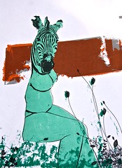
The Amazing Zebra Lady
21.8.08
I will solve your problem and you will pay me.
There is a very interesting experiment here comparing some of the more popular online logo-t0-order companies, in terms of service, understanding the brief and result. It’s a long read but worth reading through to the end, especially for the final paragraphs:
There’s a brilliant interview from 1993 with former NEXT Chairman, Steve Jobs on working with Paul Rand to design the NEXT identity. Paul Rand was a master of semiotics, and an iconic American identity designer until his death in 1996. Jobs asked Rand if he would come up with a few options. Rand replied, “No. I will solve your problem for you, and you will pay me...if you want options, go talk to other people.”
24.7.08
Beyond blogging

Base One, where I spend my days, has just launched a blog. So what? Well, it leans more heavily to business-to-business whod’ya'ma’whatchits than many others out there, as well as aiming to be thought leaders in integrated communication strategies. Oh, and I am also writing every now and then, but don’t fret – I won’t be getting too serious. We’ve had an illustrator to pimp our avatars for the blog and this is mine, and while it doesn’t look much like me I do quite like it.
23.7.08
Lenticular Helvetica
On at the London Print Studio where I am currently doing a short screen printing course.
17.7.08

10.7.08
It seems I am in Sync®.
 The lovely people at Creative Sync think that what I do is worth mentioning, which is nice of them. So here’s a big hello to them. Thanks guys, and Rebecca. The piece you are looking at is best described as a visual representation of the processes involved new product development tool set (aka InnoSuite) for TNS. Confused? In essence their four tools enable loose ideas to become reality. Easy.
4.7.08
Typolution
A simple typographic animation about industrialisation and its effect on the environment.
3.7.08

2.7.08

Walmart logo designed by Walmart store
The new Walmart logo looks, to me, as if it was designed by a Walmart store, not a professional typographer or designer. My initial reaction was, “is that it?” which I think isn’t what they were after, but maybe, after an age of continued bad rep for human rights issues and the like, a less impactful brand position is just the ticket. My favourite comment so far from BrandNew describes it as a sphincter.
29.6.08
Ink Portrait
I've been shuffling some papers around this weekend and found this piece hiding from me. Its a slightly different style than usual but one I think I’ll be working soon.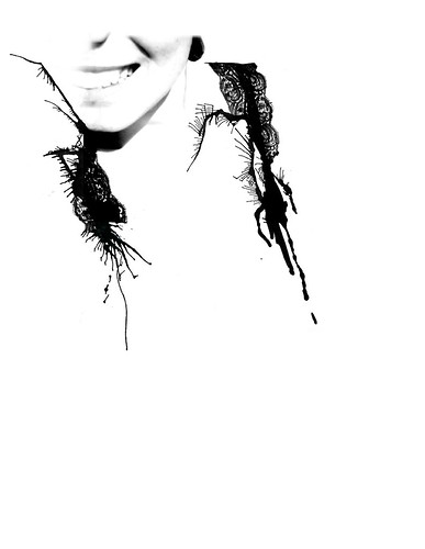
27.6.08
101 Photoshop tips in 5 minutes
Don’t watch this if you don’t use Photoshop. In fact, unless you use Photoshop a whole heap then I’d suggest skipping it completely as you will not learn anything and your brain might ache. If however, like me, you use it for more hours a week than you spend reading books, hanging out with your friends or stroking puppies you might get a kick out of it, and perhaps, pick up something new. Via LifeHacker.
26.6.08
Pecha Kucha at the Hayward
I’m getting a bit out of sequence here, but while everything is still fresh in my mind I’d like to strongly suggest that if you haven’t ever been to a Pecha Kucha event yet you must. It was fascinating stuff. As we are in the midst of London’s Festival of Architecture (with the Hayward’s Psycho Buildings programme) all the talks were architecturally themed, which I was unaware of at the beginning, but glad of mid way through. 20 seconds can be both a lifetime and a flash depending on who is time-lord, and most of the time we were in good hands. I’d love to go in more details about what happened but it will turn into a list, and I wasn’t really taking good notes: Useless Magazine’s funky handmade graphics. The wholesome idea of Edible Estates. The chaps behind the Lift Structure and it’s wonderful quitled graphics, and a pair of French hippy architects whose names I’ve already forgotten, who were sleeping in tents in a derilict area of London to understand the land before erecting their temporary structure.
Experimental Jet Set rock.
The always brilliant Experimental Jet Set closed off this years D&AD summer talks with a glimpse at some old and work-in-progress. With their adorable funky dutch accents you’d be hard pushed not to warm to this team; and there work is something else. Rather than try to summerise their presentation I’ll let you have a look for yourself.
Experimental Jet Set
Experimental Jet Set
World famous online

14.3.08
2. Alexander Rodchenko

“One of the greatest figures of early 20th century avant-garde art”. Or so they say.
If I were to sum him up I would say that Alex was a handy chap to have around, especially when he had a camera to hand – especially if you didn’t mind a jaunty angled composition. Some of his pieces are very impressive, some more reportage of the current situation in the Soviet Union , and some you have undoubtedly have seen countless times before, unknowingly (2nd from the left).
That said it was his layouts and collages for the the legendary Lef Magazine that stayed with me, in particular No 7 which I happen to have recreated here in-house in the hope that the idea I had at the time will stay with me until the time is right.
11.3.08
1. From Russia with Love
 I am sure much has already been written by better writers than myself about the From Russia exhibition at the Royal Academy, so I am just going to highlight my favorite bits:
New to me was the work of Sergei Sudeikin, or more particularly the funkiest clouds on show his Giselle (1915). Unfortunately I can't find a thumbnail on the web, so you'll just have to cough-up the £13 yourself, or take my word for it. |•| On the subject of funky, that camel in Date Palm (Martiros Saryan, 1911) it up there. And could be a pre-Dakar Rally example of sponsored desert transport. |•| Marc Chagall's The Promenade (1917–18) was lovely, and it was fun to watch the school group, sprawled across the floor trying to capture the image, but as I recall everyone was drawing the couple, no one drew the leaves which were the best bit in my eyes. |•| The award for Most Incredible Painting I have seen in years has to go to Pavel Filonov's German War (1914–15). You can see it here, but it doesn't even look like the same thing in a digital coat.
There were more but like I said, go look for yourself. It's worth it.
10.3.08
22.2.08
A better way to view the web
 This add-on the Firefox/IE/Safari
is better than you think. It makes viewing images on the web effortless, like how it should be. Get it from PicLens here.
10.2.08
Rapid Beard
 Just brilliant don't you think. If I knew who they are I'd credit them directly, but instead you'll have visit here to DIY.
29.1.08
Made in Afghanistan
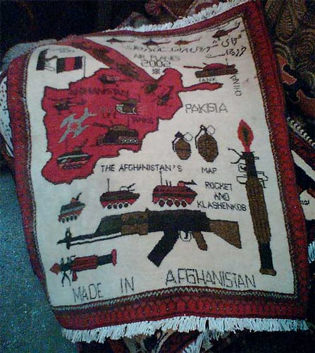 Evidence that politics radically effects traditional designs? You decide. Seen in a shop full of ‘ethnic’ wares in the west country.
18.1.08

 Lovely stuff. More
 8.1.08
Online tutorial with a twist
Via. It's only funny if you use photoshop and have followed online tutorials, but worth sharing.
7.1.08

2.1.08

Taiwan’s Brilliant Recycle logo
 “The negative space from the four inward black arrows creates four outward white arrows.” Via
Subscribe to:
Comments (Atom)

