27.9.08

What Paul Rand says goes

I regularly dip into John Gruber’s excellent blog Daring Fireball which often offers tasty nuggets to line my creative stomach, as well as technical wizzardry that confuses the pants off me. This one was a goodie, and I quote:

“The odd saga of Microsoft’s nascent $300 million rebranding campaign brings to mind this nugget of genius from Paul Rand:

A logo is less important than the product it signifies; what it represents is more important than what it looks like.

This holds true not just for logo marks specifically, but also in the broader, more abstract sense of brands in general. No brand is better or stronger than the products and experiences it represents. A good brand is strong because it is true, not because it is clever.

I realise I’ve quoted Rand before, but he is that good.

25.9.08

Subliminal behavior modification

I was on the London Overground the other day and had a revelation as to the reason for the increase in knife crime in the city.
Subliminal behaviour modification? You decide...

23.9.08

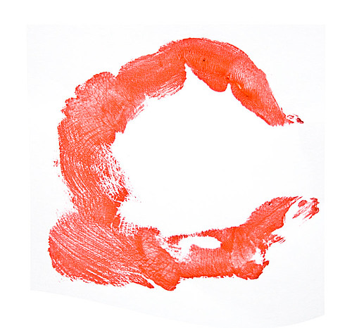
Handmade Typeface


The excellent Bittbox has initiated the development of a community font. This is my submission. Quite literally hand made.

15.9.08

Brand new work


VCT AIM, originally uploaded by smoothfluid.
We’ve been busy working on some fresh new illustrations for the re-brand of venture capital trust company Baronsmead.

12.9.08

Swype me!

Interface design is definantly a subject that I readily admit is not my specialism. However, I do recognise a great idea when I see one, and I am pretty sure that Swype is it. Have a look at this demonstration and make your own mind up.

5.9.08

HSBC Lumberjack

3.9.08

High speed painting

This has to be seen to be believed.