11.3.09

Sydney Shep at TypeSHED11


I'll be honest and admit that the idea of sitting though a 45 minutes history lesson of what I tend to regard as a naff bit of laziness didn’t interest me much, however I was to be proved very wrong. Sydney presented a very interesting piece indeed and if you were to take home anything let it be this:
“The smiley was born on 16 February 1882”
At least that is what her research in the much loved St Brides Library tells her.
More on flickr.

10.3.09

Mother of All Funk Chords

A wee musical interlude from the TypeShed11.
Let the people do your work.
More here. Via UrlGreyHot.

26.2.09

Masayoshi Kodaira at TypeSHED11


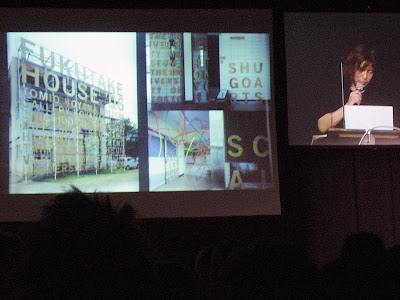
Hold crap this guy is the biz. Without a doubt Masayoshi has the BEST way of presenting his work I have ever witnessed. Not that he needed it. His work is outstanding. His understanding of print processes and finishing is phenomenal. My account won't do it justice. My cheap, blury snaps are hardly worth showing. Hunt out all the work you can find and study it. And try to be half as good. I wish.

Bruno Maag at TypeSHED11


I have always respect what Bruno has had to say (I even have a set in my Suitcase of ‘fonts that Bruno recommends’ that I gleaned from an old issue of Baseline) so was keen to see him in person and witness his passion, and man, is that guy passionate about what he does.
He spoke primarily about the global village and how one shouldn't neglect the cultural aspect of an area by forcing Latin alphabets on them, nor by just dropping in whatever alternative tanslation you can find. An example: Dalton Maag is working on Dubai's metro system where the signs need latin and arabic information. If one is going to do it properly the arabic needs to match the latin (or vice versa) in which case one will have to create it from scratch. And to do it properly one needs to know about the language, the letterforms, how it is written (the angle of the pen is differnent by 15 degrees for a start). So Bruno's team are all off to learn Arabic.
He also had some strong words to say about the 2012 logo and the typeface, but that is old news.
Oh, and he is more passioanle about food. Seriously, if you see him ask him about food. He knows one or two things.
Photos on Flickr.

Indra Kupferschmid at TypeSHED11


Picking a typeface, the right one, not just anyone can be a mare, but like the Lone Ranger on Silver Indra Kupferschmid came the the rescue with some thoughts on how to think outside the box. She is also responsible for the new font classifications, like the one the FontShuffle iPhone app I think. If there was one idea to take away it was “don't worry, people generally will read it anyway,” a thought that helps me sleep at night.
Photos on Flickr.

Kris Sowersby at TypeSHED11


Always the entertainer, Kris has trouble zooming out and was keen to share this with the audience. His job as the kingpin at Klim is to lock himself away and massage a typeface into something new. It is the minute details that turn him on. So he is always surprised when this creations are set free and become more than he foresaw. Like the new typeface for Methven.
Methven was rebranding and wanted a bespoke typeface, something that had loops/drops (hey it is all about water). Taking National, a face he designed (so he knew he wouldn't get sued!)he worked it into a new direction then left it in the hands of Tana Mitchell to work her magic.
More on Flickr.

22.2.09

Experimental Jetset at TypeSHED11


I have been lucky enough to see this Dutch trio on a couple of occasions and they never fail to amuse and inspire. They focused on their influences this time; the things that they saw that got them where they are. Like how an anarchic backwards 'a' inspired them to turn their text upside down, or how the jewelry in an exhibition was only viewable from outside the gallery, leaving the inside virtually empty, and how the language of two-tone, and Prince inspired their punk minimalism. And how this led to other things.

Bat Macumba & Experimental Jetset from Caspian Ievers on Vimeo.

See them on Flickr.

Kelvin Soh at TypeSHED11


One half or Auckland outfit The Wilderness, Kelvin leans heavily on the side of design as art. This talk, entitled design in the space of friction, focused on the idea that something is only useful if it is used, but not necessarily for what it was designed for.
The designer might make suggestions but at the end of the day the control is in the hands of the audience. An obvious example is that of skaters in urban environments using the architecture to their own advantage, but Kelvin showed a great piece that filled the gap between exhibitions at an Auckland gallery. In essence a non-poster, empty with a different frame or border each time. Tween posters. In his own words they celebrate uselessness. But after few have been put up the viewer then adds meaning to them, i.e. there is no exhibition at the moment but there will be soon. Ironically, having completes a series of them they were all exhibited in the gallery.
More at Flickr

Christian Schwartz at TypeSHED11


Type designer extrordinaire Christian spoke about how the Font Menu gave us choice. Type is clothing for words, but like clothing we all have different tastes. Some of these tastes are regional; like Franklin Gothic in USA, Gill Sans for UK, Vendrome in France.
See more at Flickr.

Sarah Maxey at TypeSHED11

Sarah collects everyday words and phrases and draws then, exaggerating their importance and often imparting a different meaning to them in the process. And she is very good at it too.
See more at Flickr.