I say that flat is the new black; that 2D is the new avant-garde; that a surface doesn't have to be ashamed of being a surface. Technology users of the world, unite: you have nothing to lose but your bas-relief buttons. Let us march forwards together, spurning chrome, into a cleaner, lighter future.
More here
Showing posts with label design. Show all posts
Showing posts with label design. Show all posts
7.2.11
Flat is back

1.10.10
This will change your life
OK, maybe the headline might be a bit strong. Especially if you don't use InDesign everyday. But if you do, you need to get LayoutZone. And best of all it won't cost you a cent.
See it in action here.
LayoutZone allows multiple InDesign users to work on different sections of the same page simultaneously and with more control. LayoutZone lets you quickly select several InDesign page elements or frames and automatically convert them to a Placed InDesign file (.indd) for editing outside the master document. Once external editing is complete, a seamless round trip workflow automatically converts the linked InDesign file back into native objects.
See it in action here.
23.6.10
Grafik is dead. Long live grafik

The current owners of Adventures in Publishing (the company which publishes Grafik) have decided to liquidate the company, so unfortunately we are unable to print the magazine for the foreseeable future.
More here.
5.5.10
48hr Mag

Here’s how it works: Issue Zero begins May 7th. We'll unveil a theme and you’ll have 24 hours to produce and submit your work. We'll take the next 24 to snip, mash and gild it. The end results will be a shiny website and a beautiful glossy paper magazine, delivered right to your old-fashioned mailbox. We promise it will be insane. Better yet, it might even work.
I think it’s a brilliant idea, so I’ve signed up. Mind you the timezones might be a problem as it is scheduled to start at 4am. Awesome. Find out more here.
1.5.10
Somewhat Different
 I was lucky enough to be invited to the opening of the Goethe Institut’s exhibition ’Somewhat Different’ in Wellington. If you are in the area this month stick it at the top of you list of things to do. Anyone who claims that the Germans have no sense of humour need to go with you too. Brilliant, just brilliant. Above are just some of the highlights. (click for larger version)
28.4.10

13.3.10
RedRam
 Having kept my mouth shut for ages about this 'secret project' I was working on at Icebreaker I can now reveal what it was all about. RedRam. Not as premium as Icebreaker but if you love merino this is where you can start…
28.11.09
Help Portrait
 Help Portrait is a movement of photographers who are using their time, equipment and expertise to give back to those who are less fortunate this holiday season. If you are interested in getting involved on Sunday 12 December just follow the links.
This is the poster I designed for their cause.
15.11.09
More Munn
 If you didn't see Jason Munn’s lecture last week, you should really visit his poster exhibition on Tory Street before 21 November.
10.11.09
Jason Munn tonight
 If you aren’t going to see Jason Munn tonight in Wellington you’ve really got to ask yourself why. So, I’ll see you there.
9.11.09
Eric's head
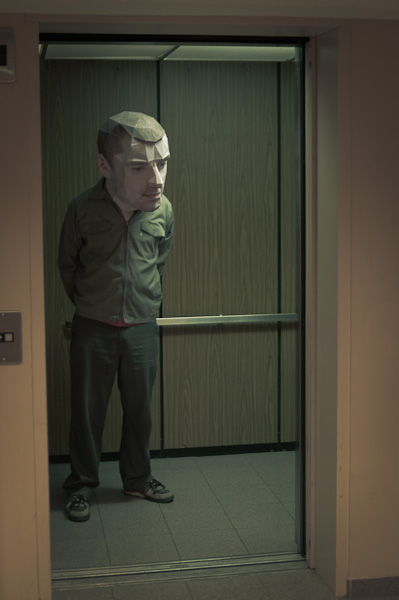 Eric Testroete wins the award for best Halloween costume ever. Brilliant. Quite brilliant. And disturbing.
27.10.09
Awesome illustration of not me
 A totally random find here: the work of Austrian designer Paul Leichtfried. In particular this piece above. Ok, I’m biased, my name hardly ever appears in print, so forgive me if I get a bit excited, it it really is lovely. Check out the rest of his work, you won’t be disappointed.
12.9.09

18.4.09
Art imitates life imitates art

As designers I believe we have a certain responsibility, or at least we ought to. More a best practice than a code of conduct, self regulating rather than a book of rules. Like not misleading the audiences, or promoting behaviours that one might find morally objectionable. Or this, seen on the back of a truck about 1ookm south of Dubai. Try as hard as I can the only message I can see here is “to hell with the red light, let’s rip!” And if you ever decide to investigate the number of pedestrian casualties on the roads in the UAE you’ll see that this message is getting through.
16.3.09
Paul Elliman at TypeSHED11

Paul Elliman is an artist and a writer, who uses letters and words in their most abstract forms to create pieces of art. I’ll be honest and admit that I didn’t know of him before he presented his work and ideas but having seen him talk I feel I have missed out a bit. Years ago I got my masters in perceptual psychology, and my dissertation was on object perception. The work I did then on lanellas and typical contours was pretty much forgotten until Paul’s presentation. Typical of his work is the distillation of an object representing a letterform to a single cross-section, its silhouette it you will, and then creating a message/idea from a collection of these forms (he never uses the same form twice). Much like Build’s Objectified piece.
He further abstrated the idea of messaging in a piece where the male and female voice artists commonly heard on the metro in Barcelona gave instructions from Spain to his house in London. Very interesting stuff and a name I will not forget.
11.3.09
Donald Beekman at TypeSHED11

Donald is pretty much single-handily responsible for all the drug (legal) and alt-drug branding and packaging to come out of Holland, through his company DBXL. And a fine man for the job really. Being in a variety of bands since his youth led him to combine his influences of music/psychedelic/acid house/punk etc into packaging that makes your eyeballs throb. But don’t just take my word for it, check out his website for a trip back in time or on my flickr for some eye-candy.
Experimenta at TypeSHED11

I have a soft spot for the guys at Experimenta (you won't see much in their site, it seems to be a blank one for now, so see our flickr). I have seen Duncan show his wares on more than one occasion and appreciate the craftsman approach, the constant struggle of setting up and maintaining design integrity. Their work is top notch too, although I sometimes feel it is a little cold. Not in the piece shown above though: they managed to get the symbol from the U.N.C.L.E into the branding for the Global Leaders Consortium. Nice.
There are obvious comparisons to the legends Experimental Jetset (and not just in name) but it is early days – they are not even 2 yet) and they have got a bright future ahead of them in my opinion.
More on Flickr.
Sydney Shep at TypeSHED11

I'll be honest and admit that the idea of sitting though a 45 minutes history lesson of what I tend to regard as a naff bit of laziness didn’t interest me much, however I was to be proved very wrong. Sydney presented a very interesting piece indeed and if you were to take home anything let it be this:
“The smiley was born on 16 February 1882”At least that is what her research in the much loved St Brides Library tells her.
More on flickr.
26.2.09
Masayoshi Kodaira at TypeSHED11

Hold crap this guy is the biz. Without a doubt Masayoshi has the BEST way of presenting his work I have ever witnessed. Not that he needed it. His work is outstanding. His understanding of print processes and finishing is phenomenal. My account won't do it justice. My cheap, blury snaps are hardly worth showing. Hunt out all the work you can find and study it. And try to be half as good. I wish.
Bruno Maag at TypeSHED11

I have always respect what Bruno has had to say (I even have a set in my Suitcase of ‘fonts that Bruno recommends’ that I gleaned from an old issue of Baseline) so was keen to see him in person and witness his passion, and man, is that guy passionate about what he does.
He spoke primarily about the global village and how one shouldn't neglect the cultural aspect of an area by forcing Latin alphabets on them, nor by just dropping in whatever alternative tanslation you can find. An example: Dalton Maag is working on Dubai's metro system where the signs need latin and arabic information. If one is going to do it properly the arabic needs to match the latin (or vice versa) in which case one will have to create it from scratch. And to do it properly one needs to know about the language, the letterforms, how it is written (the angle of the pen is differnent by 15 degrees for a start). So Bruno's team are all off to learn Arabic.
He also had some strong words to say about the 2012 logo and the typeface, but that is old news.
Oh, and he is more passioanle about food. Seriously, if you see him ask him about food. He knows one or two things.
Photos on Flickr.
Subscribe to:
Posts (Atom)


 Posts
Posts


