 A while ago some friends and I visited a small, but impressive, exhibition of Mr Hughes’ photographs. The quality and awesome size of the images stuck in my head, so it is hardly surprising that when I visited the South Coast I was keen to see if I could get to grips with how he might have produced his images. (True, my memory wasn’t 100% and my results are not quite right, but I think I have learned a bit more about the medium.) Mine are the right two, and actually, now that I look at them again I see I have a way to go!
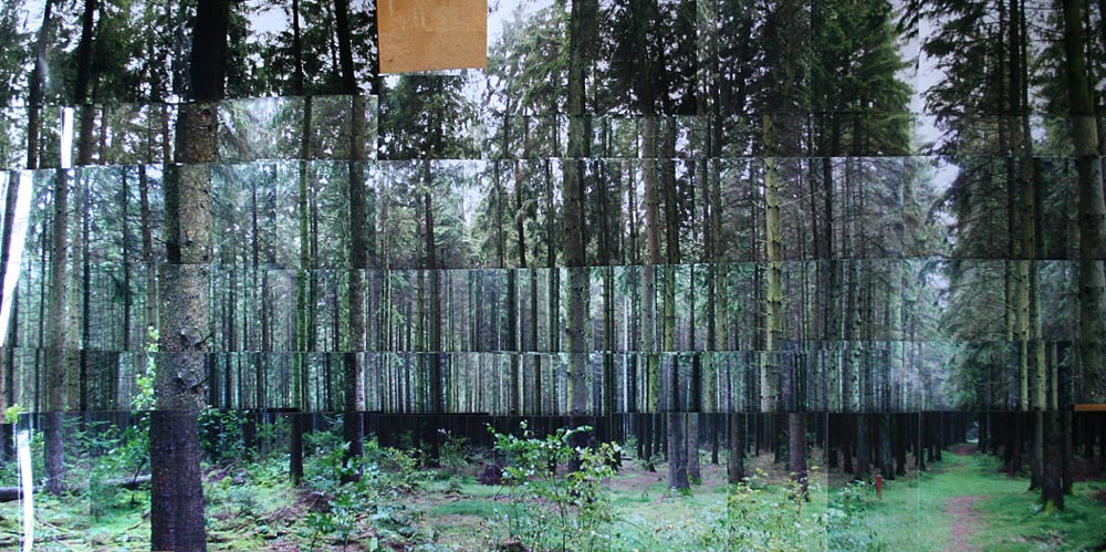
13.12.07
Nicholas Hughes, photographer
A while ago some friends and I visited a small, but impressive, exhibition of Mr Hughes’ photographs. The quality and awesome size of the images stuck in my head, so it is hardly surprising that when I visited the South Coast I was keen to see if I could get to grips with how he might have produced his images. (True, my memory wasn’t 100% and my results are not quite right, but I think I have learned a bit more about the medium.) Mine are the right two, and actually, now that I look at them again I see I have a way to go!
6.12.07

25.11.07
Josh Ritter
This chap played at the Shepherds Bush Empire on Thursday and boy was he happy about it. Keep an eye open for his albums because his music is just brilliant.

8.11.07
2.11.07


1.11.07
Leandro Elrich

"The interaction between art, architectural space and setting, and the illusion factor have been researched in Leandro Elrich's work from the very beginning. Different levels of interpretation cam be brought to his work. Yet from the various possible readings it is the illusion factor that stands out. This is a topic he had explored throughout his career..."
That said, a picture says 1000 words so take a look here.
13.10.07
3.10.07
Can they do that in Word? (update)
Rant: As a designer I am being asked more and more often whether the corporate branding (letterheads, faxes, etc) that I design can then be re-created in Word by the client. And if the answer is no (or at ‘not without some effort’) the whole project has to be dumbed down so that an non-designer with no interest in the final outcome can replicate a design (where considerable thought and effort has gone into leading, tracking, kerning and above all typefaces) in MSWord, a programme that has been developed so one cannot create your wildest dreams. It's a sad state of affairs, and more to the point it saddens me that they get away with it. They pay the bills after all.
-----
Following that I decided to do something about it. I have a solution: InDesign+Acrobat 8+Forms Yay!
-----
Following that I decided to do something about it. I have a solution: InDesign+Acrobat 8+Forms Yay!
30.9.07
Wood for the Trees
 While PSCS3 is a considerable leap ahead from previous versions it still cannot do everything. This is one example. Photomerge can only get you so far and the result looking at the separate photos jigsawed in real life, with tones and colour varying, beat the automated process hands down (and the fact that 69 images is just too much for it, especially if they are all A3).


10.9.07
Underground posters

It looks like the complete history of London Underground posters are now online and can be bought for pocket money from their online store. A great source of inspiration and historical development of poster design.
5.9.07


29.8.07
There once was a farmer
 A lovely idea with brilliant execution. Some more here.
Impressions on my recent trip to Denmark will follow soon.
11.8.07
Foot Heaven

These are brilliant. I just had to buy some. They've got a special offer on right now too making it even cheaper to look great. The String Republic.
9.8.07
Graphs & Diagrams
 I've recently been taking an unhealthy interest in graphs. This book popped into the office via the States and has some real gems. More photos on my Flikr.
30.7.07
Cut&Paste [updated]
 “Casual” hardly begins to explain the laid-back nature of the Cut&Paste preliminary round that took place on Sunday in a bar in Shoreditch. That said, it was more stressful for me than I imagined possible. I wasn't that happy with my effort really, feeing that my right hand wasn't mine and my drawing was atrocious. Results are posted in a couple of days announcing the successful 8 who go through to the next, and final round on October 20th (tickets/live webcast details tbc).
[UPDATE: I didn't get through :( Better luck next year mate.]
27.7.07
Environmental Graphics

I've been meaning to put this up for ages. On the way to work, a month or so ago, I saw this box on the street soaked from the continual rain that is becoming a bit tedious. The interaction between the environment and the graphics I doubt was seen by anyone else. So I grabbed it and continued on my way. The graphic is brilliant and I love how the water actually got in the glass and left it's mark.
25.7.07
Shamelss plug (for kittens)
 Keep an eye out for this unusually named new drink in a bar near you. I'm looking forward to the evening when I hear, over a crowded and noisy bar, “…and a vodka n’pussy please mate.” It's all natural too which I guess is one less thing to worry about. Nice.
13.7.07

4.7.07

24.6.07
Drawing in Green
 Details here. Entries close 7/7/7. I'll post my entry here as soon as the paint dries.
17.6.07
Postcard (1)
 With everyone emailing friends and family there seem to be less postcards being sent around. In this first of a series I have illustrated a postcard based on an email I received the other day. This one is called: "I feel like a princess in her castle…"
©Smoothfluid 2007
Repetition Repetition Repetition
"the work of Artist Mike Nourse in the 4th Law learn as an example of how repetition can be a powerful tool for learning. Nourse took video footage from a press conference by President George Bush before the Iraq war and did a simple thing. He removed all references of “terror,” “weapons of mass destruction,” and “Iraq,” and simply edited all those parts into a single piece of video. The result embodies the kind of strength that is achieved through the power of repeating oneself."
Borrowed from The Laws of Simplicity which is worth a look at.
Borrowed from The Laws of Simplicity which is worth a look at.
4.6.07
2012. A Gut reaction?
 This is the real thing. Come on, don't be shy. Media release here.
Comments from The Guardian make an interesting read. The consensus isn't pretty.
3.6.07
St Brides (2)
Work by the talented Kerr|Noble presented projects for Liberty’s food (see previous link) as well as their exterior sign for the V&A Museum of Childhood, and Melrose and Morgan (typeface here.) Flawless presentation, despite being heavily on the 'we also did this'. Very nice bit of typography achieved by dropping a cup out of a window but I can't find a link to it as yet.
Morag Myerscough has some fantastic signage up her sleeve (but you won't see any of on her website, I've just looked), notably for the Barbican, and the Westminster Academy.
Max Gadney, responsible for the BBC news website did his best to explain how the site caters for the type of news their 5 million readers a day may want, and the manner in which it should be delivered.
Things turned a little heated when Suw Charman began to point out that there is a large hole in the functionality of most social networking sites like myspace and facebook resulting in some horrific layouts/colours/overlay/non-design, and wouldn't it be better for everyone concerned if one was able to make it all ‘nicer’ given the right tools. After all, the majority of people don't get taught design, so aids that lead them into choosing harmonous/complementary colours (a la Abobe's Kuler) would be a good place to start. Some of the audience felt that it would hinder free expression, and their choice to have their space looking how they wanted it, but I think they missed the point completely although I kept it to myself for fear of a wedgey. I would put a fiver on the fact that they havent seen how IllustratorCS3's live colour can actually make colour choice better and more advanced (and quicker) than previously
St Brides (1)
Highlights of the St Brides Great British Design conference:
Ken Garland presented work of 5 graphic designers he felt were largely unrecognised by todays standards:
The work of William Slack, designer for the Architectural Press, and later Architectural Review enjoying the freedom of designing for subscribers and throwing conventions of mastheads and cover design out of the window. // Jerry Cinnamon's work for Penguin (The Penguin Book of Decorative Art with it's double title page, 50 Years of Penguin) and Integrated Books. // Ken Briggs' posters for the National Theatre with their hand rendering and expressive illustrated posters before falling into the Swiss design trend of a 3 column grid of Helvetica. // Ken "Graphic design is not cake icing and fancy wrapping" Cambell's Fathers Hook book of letterpress poems, printed on the most fragile of papers and illustrated with some wonderful fold out letterpress artworks, that Ken generously shared with the audience, and Broken Rules and Double Crosses. // The very topical Alfred Wainwright and his Pictorial Guides to the Lakeland Fells. It takes a certain type of person to produce a series of books over so many years entirely by hand, the level of attention to detail and concentration for such a long period is outstanding (OCD?) and it was interesting to consider the idea that, without knowing it, he was in fact a graphic designer, and publisher and an artist.
31.5.07
Great British Design?
 I still am not sure what the “?” is all about. Today there were some interesting “!” moments. Maybe by the end of tomorrow I'll have a better idea. I'll pop some insights up once I have deciphered my notes. In the meantime there are some photos on Flickr.
30.5.07
Representation
 This is what this blog looks like through the eyes of some crazy javascript programing. Pretty I think you'll agree.
24.5.07
On Tour
 While not specifically design related this news is worth spreading, after all great tunes spur my creativity and these cats are top shelf. Pleased as punch that they'll be in Europe this summer. Tickets selling fast. but if you miss out their website is worth tuning in to for oil-slick grooves.
8.5.07
Go directly to jail
 I have just joined the not-so-exclusive club of ‘victims of fraud’, or, to be more specific: skimming. If you happen to see pkrser.com on your bank statement you too might have had a considerable sum of money removed by devious means for some online gambling shenanigans. Exactly how and when remains a mystery but I'd be fairly happy to bet (am I am not a gambler!) that the arsehole will be not even get a slap on the wrists if the system ever bothers to track him/her down.
“I hope you lost it all, you continue to loose everything, your life spirals into a dark and bottomless pit and you never experience a glimmer happiness ever again.” And then some.
30.4.07

24.4.07
Discarded design
 The design tastes better than the contents ever did. Cast aside design in Whitley Bay.
12.4.07
Design Responsibly (1)
 Not one to jump on too many band wagons, especially those touting the ‘green’ card, many of which may not have any real impact whatsoever, I have just seen this on FontFont and it felt good, in a non tree-huggy way, it felt that it was an easy step in the right direction. Sign up, buy/download it and save a tree, or at least a twig. Or maybe just use condensed fonts from now on.
"FSI FontShop International proudly announces FF Mt, Erik Spiekermann's most economical typeface ever. Employing obscure but powerful techniques like vwl mmssn and cap reduction, FF Mt uses up to 50% less paper, screen, and wall space than other text faces without a single condensed letter."
8.3.07
1st Base
 Much like all 1st bases this one is just as exciting. After a few months disguised as a full-time freelancer I have joined forces with the notable Base One Group. Commuting has its moments although I intend to put a stop to that with a bike before too long. 2 hours training every day will soon offer me other firsts no doubt.
4.3.07
Quiksilver, original thinking
 Quiksilver used to have this reputation for pushing the boundaries. David Carson certainly had a lot to do with it, but recently they haven't been up to much that extreme. Until now. Or have they...
14.2.07
News just in: Vormator
 I have just heard that my submission will sit alongside those of a very notable bunch of designers in Vormator's The Elements of Design book, to be published later this year. More details as and when I know them. Suffice to say I am chuffed to bits.
6.2.07
Dolk


Another tit-bit from my recent trip to Bergen: the work of Dolk Lundgren first-hand. Other bits and pieces can be seen here There is always going to be a debate about art/strencil/graffiti here. I am not going to go into that but instead say that all the pieces I saw in Bergen were on street furniture, or modern structures which, as Bergen is a World Heritage centre goes to show that the two can co-exist without it being historical destructive.
There were a couple of other interesting pieces that look familiar, and then there is the ear…
31.1.07
Self
 The author. It shouldn't look unhappy, but somehow ended up melancholic. I thought it might also seem like I was wearing makeup, in a way I am glad that didn't happen…
News just in: Branded
 News just in; Smoothfluid has been selected to join 130 other designers in a showcase of branding, published by Début later this year. Details on the release date will follow.
I went to hear and see Matt Pyke from Universal Everything show off some eyekandy at the Apple Store last night. Witnessing their work is like injecting E-numbers straight into your eyeballs; a giddying assault of sound and vision, with some gloriously rich tapestries of weirdness. Big fan. Very.
30.1.07
Bergen; a fact
 There has been over 80 consecutive days of precipitation in Bergen, Norway, to date (left). It's a small wonder that the place doesn't smell of damp socks. More to follow.
19.1.07


17.1.07
Wacom welcome
 I've been toying with the idea of buying a tablet for a while, but was always put off by my quick 1 minute trials that left me feeling devoid of all hand-eye coordination. Recent blogs on the topics spurred me on and I am now the proud owner of an A4 Intuos3 thanks to shopping around online. 24 hours in and I feel I've got the hang of it. Admittedly it is a bit too big to carry around with me (but I could always get a smaller one too!). I have a feeling there is change in the air with regards to some of the output of Smoothfluid. This is the first piece I've created with it and it was remarkably easy to work on.
12.1.07


The Reeperbhan
 I'll let this picture tell the story of my recent trip to the Reeperban in Hamburg. It sums it up the vibe of the place nicely.
2.1.07
The Eszett
 My gut reaction to the eszett (the German ‘ss’ or more particularly ß) has always been one of discomfort. Its shape, size, proportions seem typographically clumsy. While I was in Germany over Christmas I have attempted to get a greater understanding of this peculiar character, and it’s variations I saw day-to-day. Here’s the first set: street signs.
Subscribe to:
Comments (Atom)

